Brand Identity
Reviera
Agency: move:elevator
Art Direction; Identity Design
The Challenge
Stadtwerke Witten is currently constructing a new indoor swimming pool in the Annen district, set to open in late 2027. The facility aims to serve two distinct groups: families with children looking for recreation and adults focused on fitness and exercise.
The project required a brand identity that could bridge the gap between a dependable public utility and a modern leisure destination. A key constraint was the brand heritage; the Stadtwerke already utilized a whale as a mascot for their existing children's programs, which needed to be integrated into a fresh, contemporary visual language that appealed to all age groups.
The Process
Our agency began with an in-depth analysis of the Witten market and its various consumer segments. As I was part of the project from its inception, my role was heavily strategic. I focused on translating our market research into a cohesive and highly distinctive visual direction.
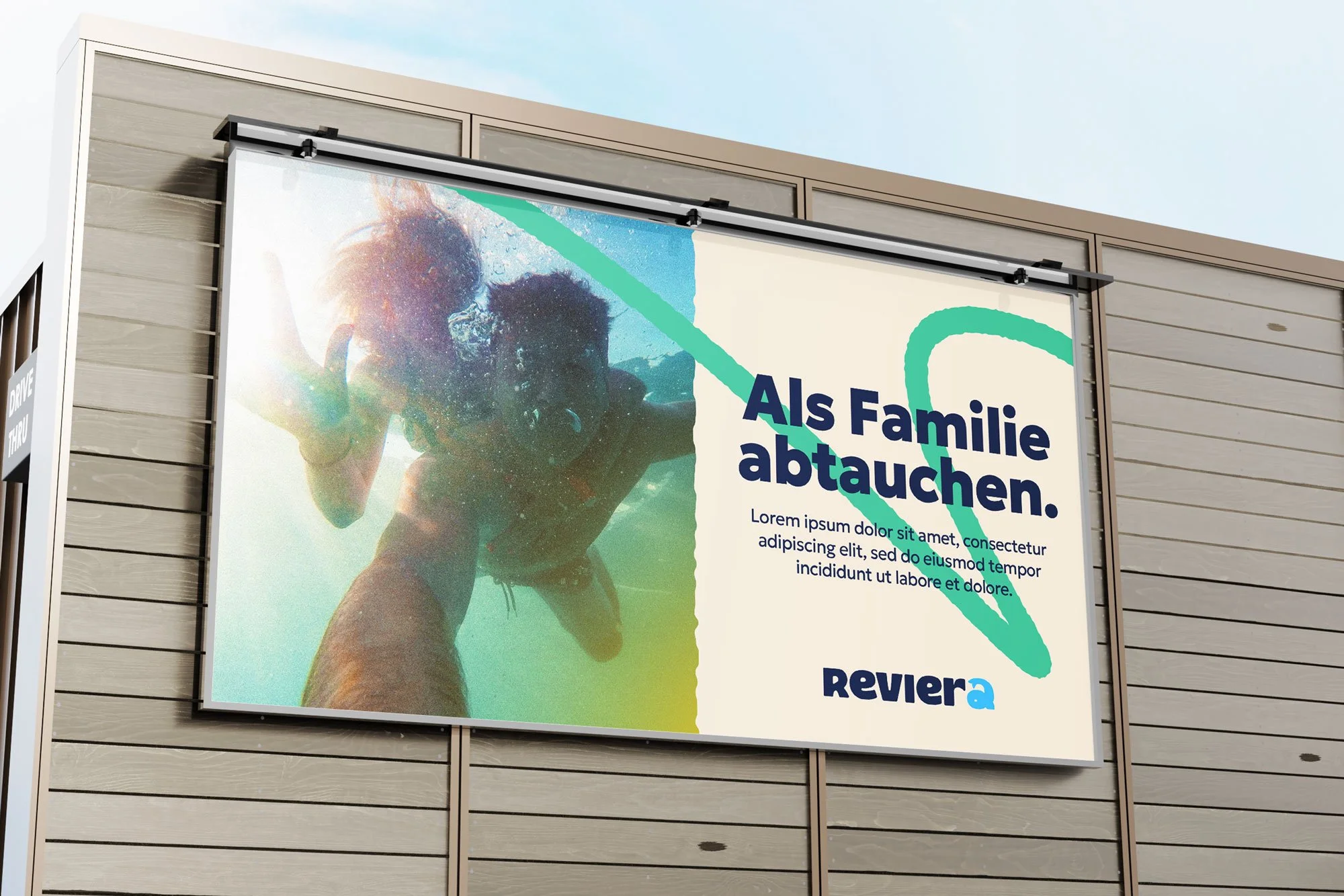
The name "Reviera" was established, a clever play on the local “Revier” (Ruhr region) and the relaxation of the “Riviera.” With this foundation, I developed several "look and feel" directions. The primary goal was to move beyond a simple logo and instead create a collection of Distinctive Brand Assets. This ensures that the brand is easily and quickly identified by the public across various touchpoints. I experimented with typography and shapes that felt organic rather than industrial, ensuring the brand felt approachable and lively. I presented this in the form of stylescapes very early on in the process, thereby guiding the client and simultaneously them feel part of a collaborative process.


The solution
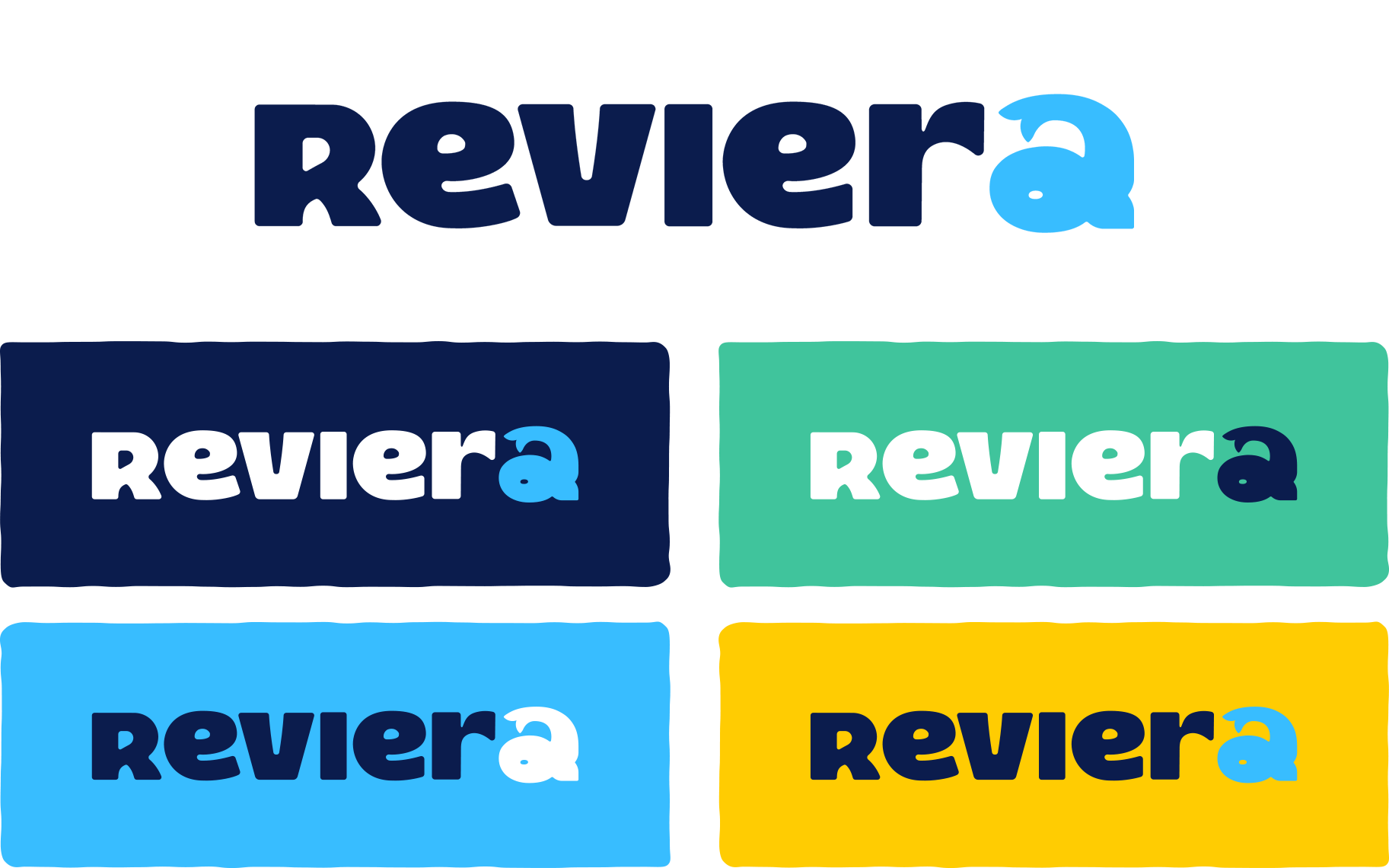
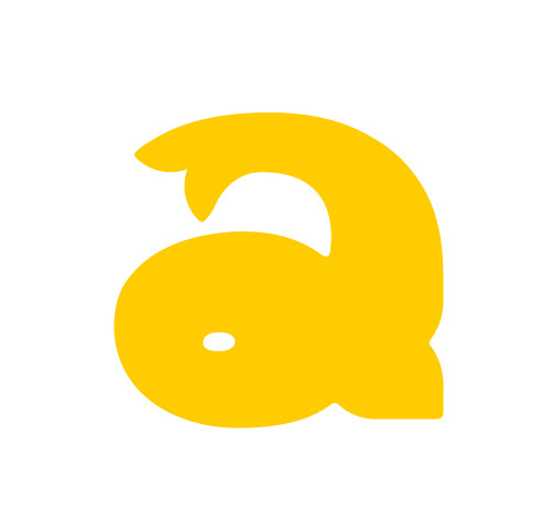
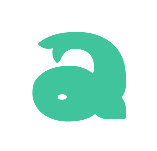
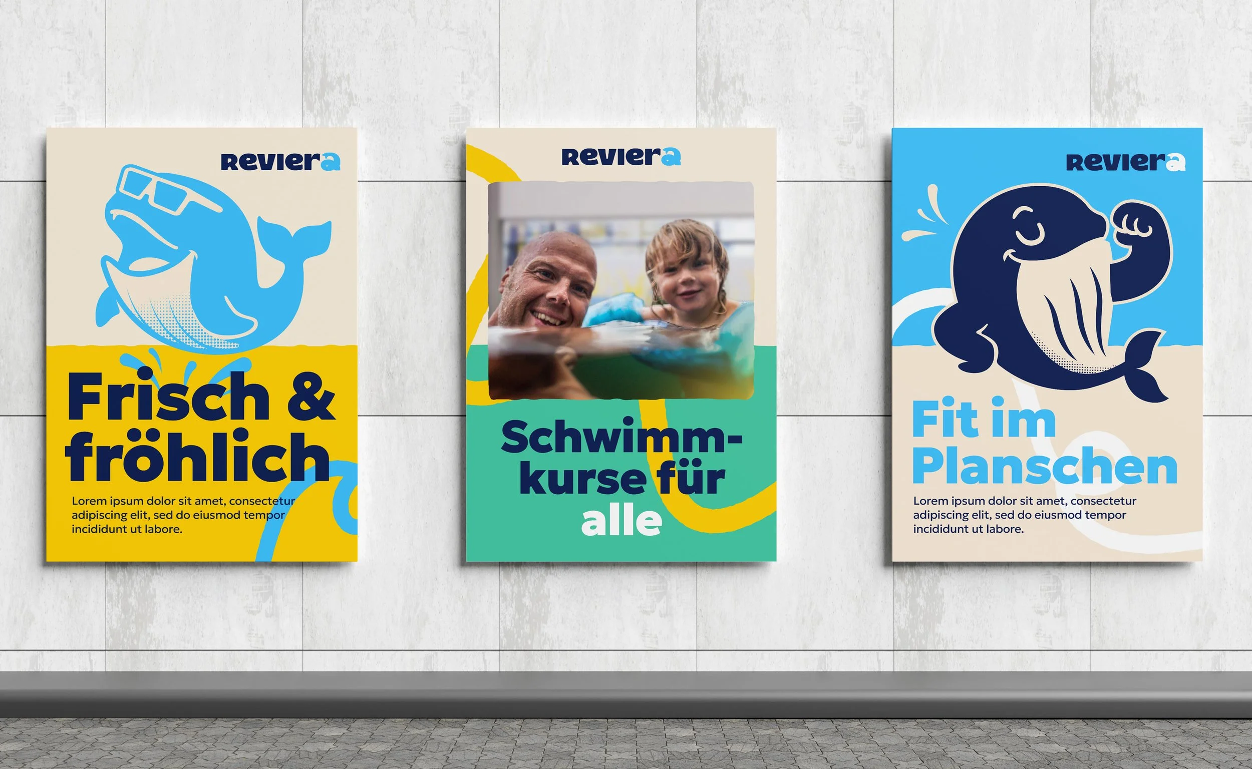
The final brand identity centres on a custom wordmark and a revitalised mascot system. The "Reviera" logo uses a specific typographic treatment where the letter "a" is differentiated to ensure the name is read correctly as a pun, rather than the standard "Riviera." This unique "a" also serves as a subtle home for the Stadtwerke’s signature whale, seamlessly linking the new facility to the parent brand.

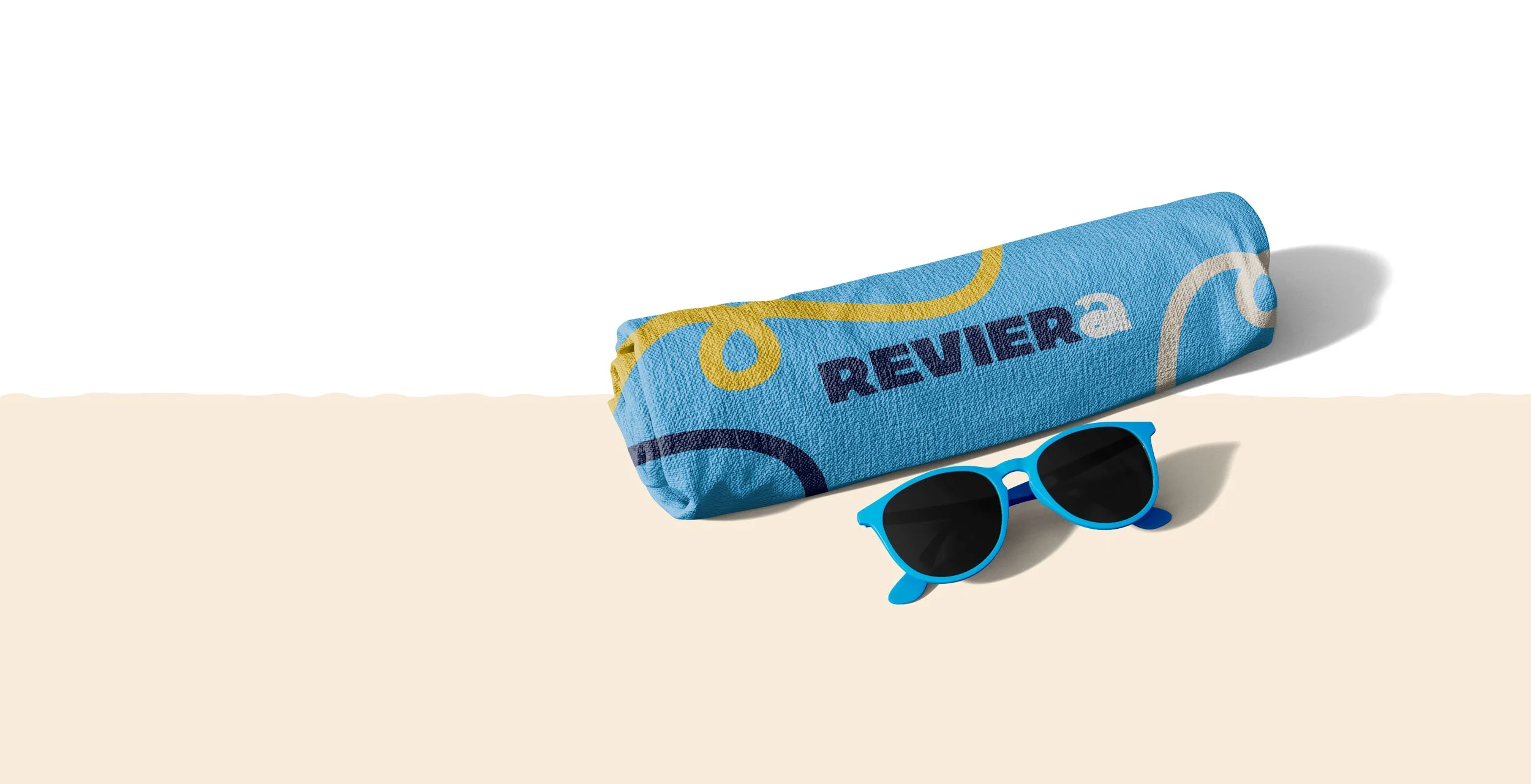
Key brand assets
The Look: We stuck with the original Stadtwerke brand colours to keep that trust, but used them in more lively, "splashy" combinations.
The Character: Since research shows that unique characters are branding gold, we included a modern, illustrated version of the whale mascot.
The Typography: Using "bubbly" but professional type helped bridge the gap between "fun for kids" and "serious for swimmers."
The client loved the design system and approved it on the spot. I attribute this to an efficient workflow and a 'lead-from-the-front' approach that integrated the client into the decision-making process from day one.