Brand Identity
TKO
Agency: move:elevator
Brand Identity Design, consultation
The Challenge
Tourismus und Kultur Oranienburg (TKO) is a municipal organisation responsible for the strategic promotion and management of the city’s primary cultural and tourism assets. Tourismus und Kultur Oranienburg (TKO) faced a critical issue of brand invisibility. As a municipal subsidiary, its identity was historically tethered to a parent company, resulting in a generic, descriptive presence that failed to stand out in the competitive tourism and culture sector. The primary objective was to decouple TKO from this shared corporate gravity and build a high-performance, standalone visual system.

Beyond the visual invisibility, the strategic hurdle was one of functional brand architecture. TKO operates across four distinct divisions: the park (Schlosspark), the harbour (Schlosshafen), events, and tourist information. Each required its own visual footprint to stay relevant to specific visitor segments. Under the previous administrative look, these divisions lacked the autonomy to build their own market presence, leading to brand dilution.
Critically, these four divisions needed to be branded in a way that made them clearly distinct from each other yet instantly recognisable as part of the same family. A key constraint of this architecture was hierarchy. The sub-brands needed to be distinctive enough to function independently, but they could never compete with or distract from the master TKO logo.
The process
The strategy focused on identifying and amplifying unclaimed visual territory within the Oranienburg market. Rather than relying on industry clichés, I led a process centred on the development of Distinctive Brand Assets. My role was to bridge the gap between TKO’s operational diversity and the need for a singular, authoritative market presence that could house its various sub-entities.
By utilising stylescapes as a strategic filter early in the process, I was able to demonstrate how different creative directions would achieve market differentiation. This lead-from-the-front approach ensured that design decisions were based on objective project goals, specifically scalability and memorability, rather than subjective preference. This efficiency allowed us to reach a final, high-impact direction in just two rounds of refinement.
The Solution
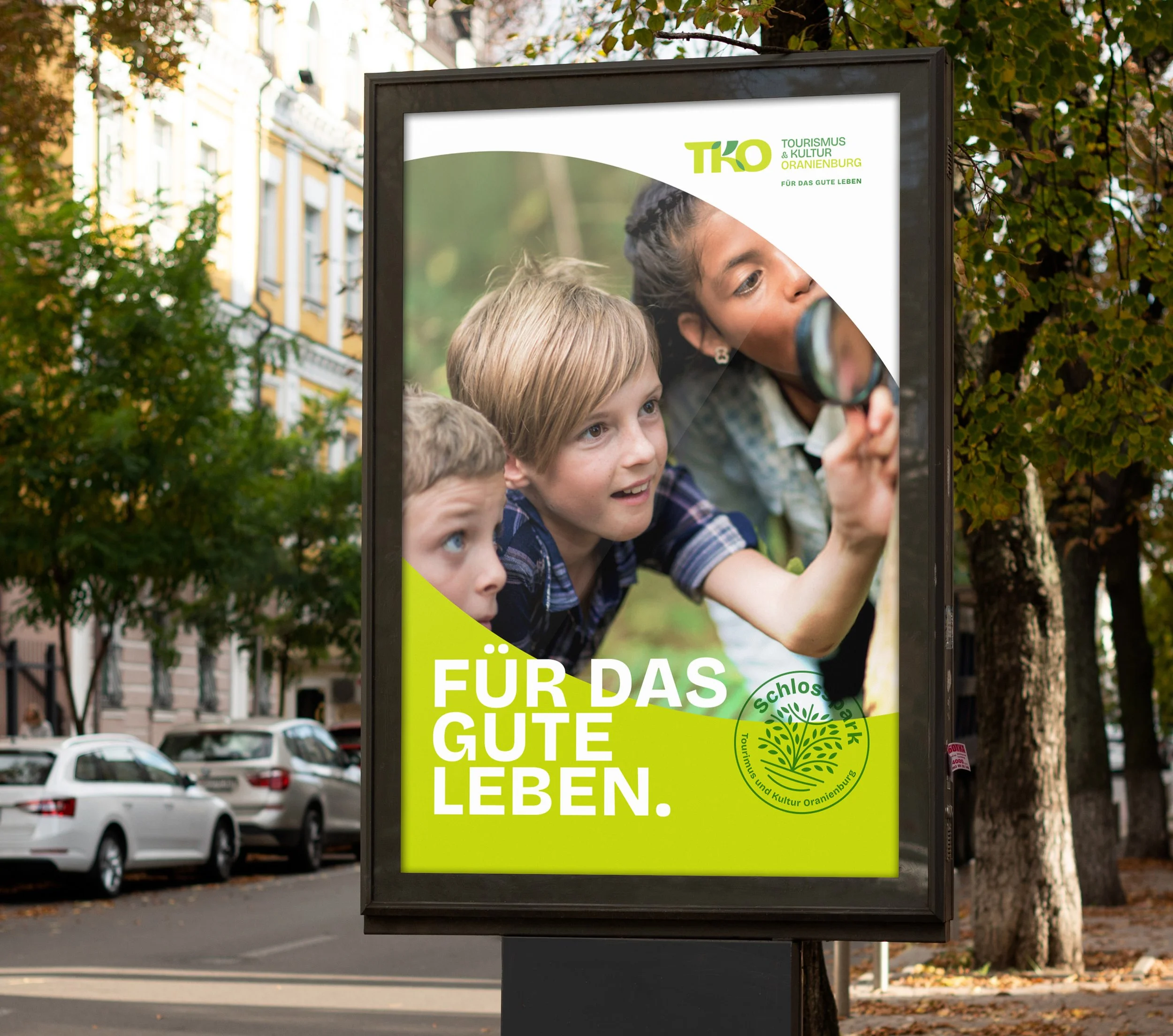
The final identity is built on a custom monogram and a proprietary visual language that prioritises visual saliency. We moved away from a descriptive wordmark to a proprietary mark that functions as a visual anchor across all media. This system creates a clear competitive advantage by ensuring that every touchpoint, from digital apps to physical signage, is unmistakably TKO, effectively increasing the brand's mental availability.
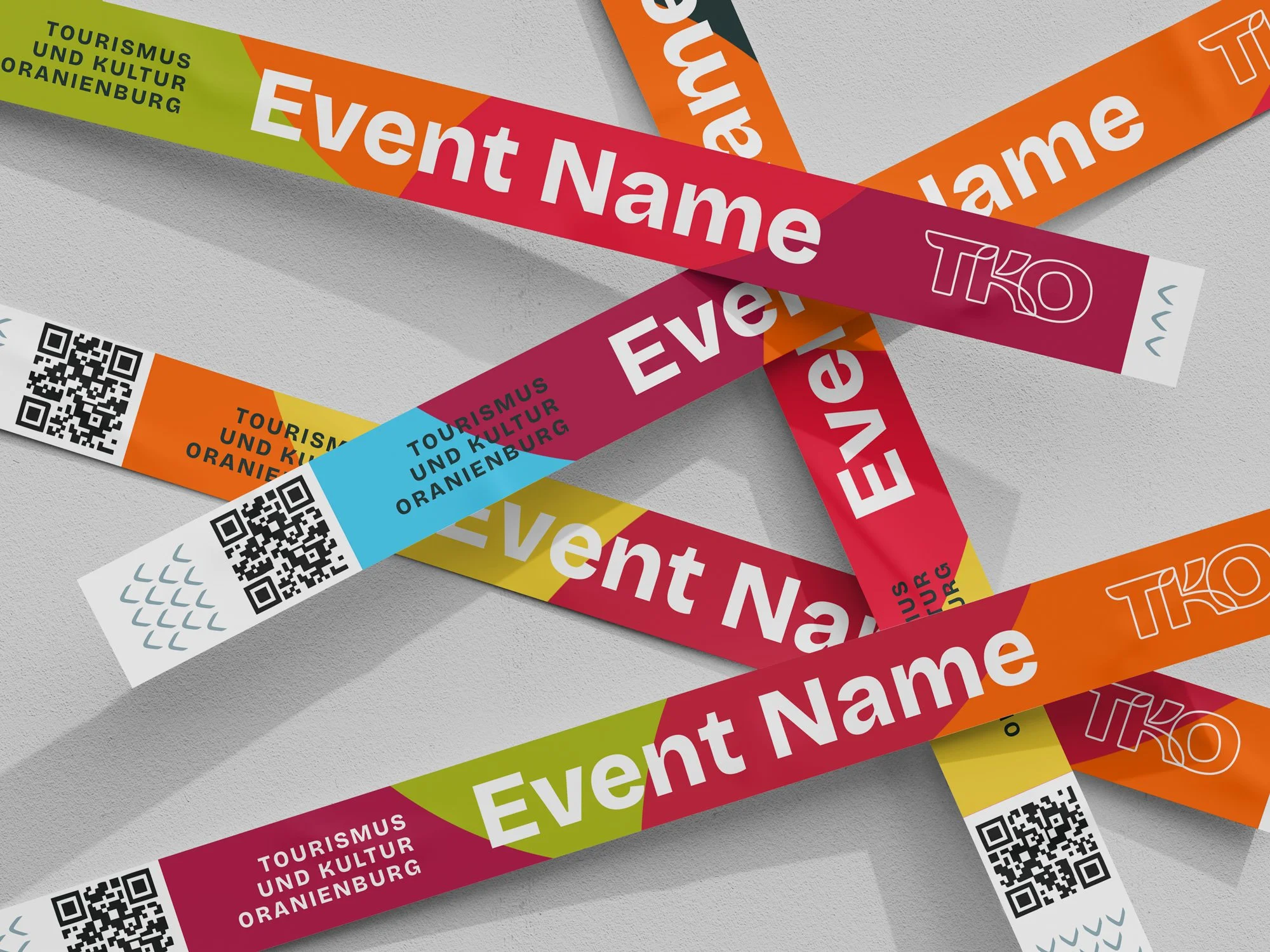
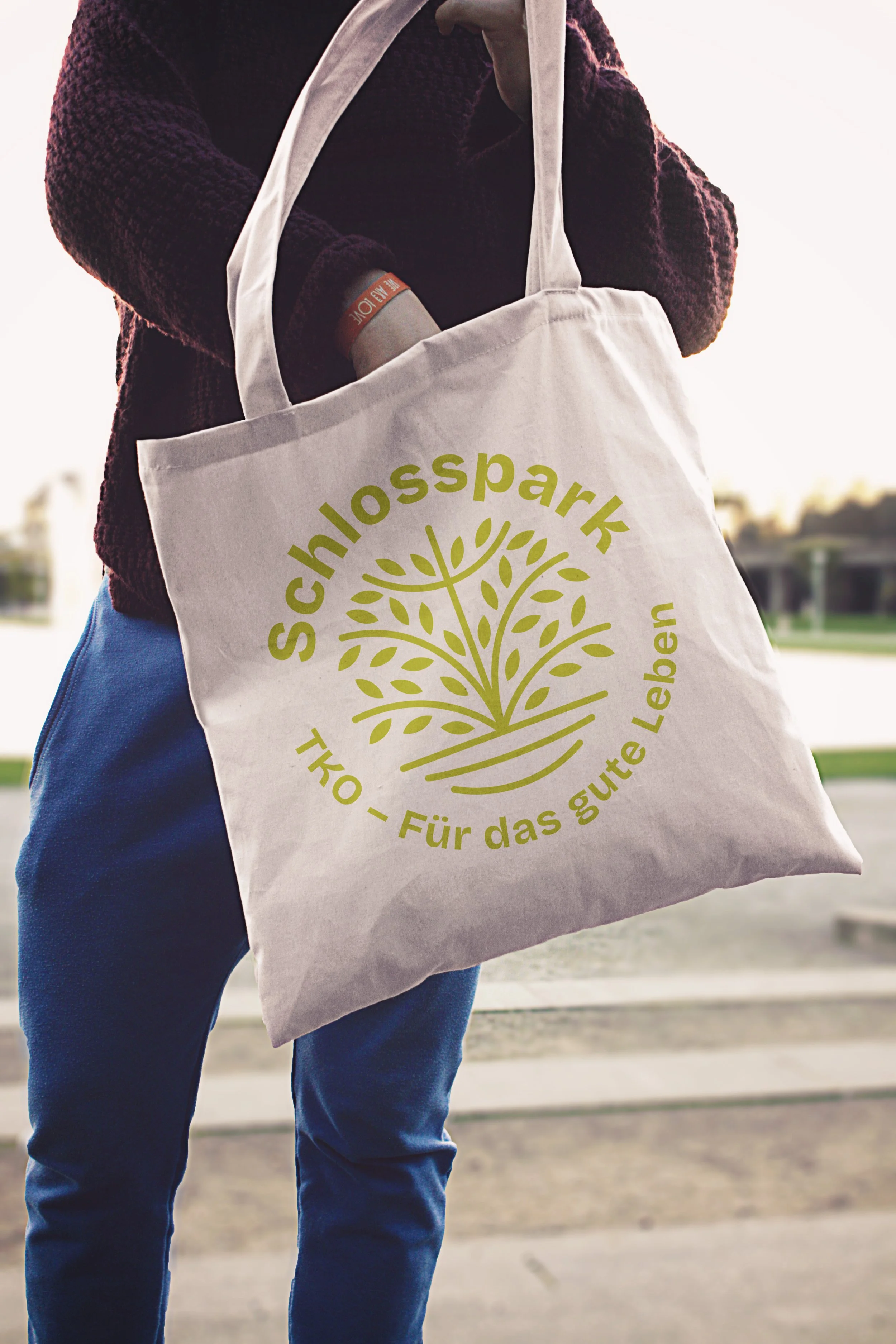
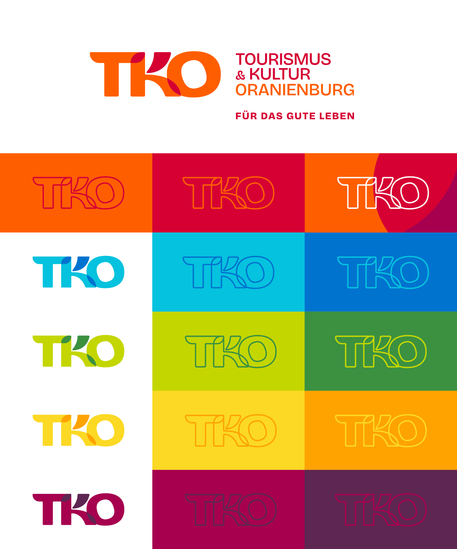
To achieve clear differentiation across the four divisions, we developed a system where each entity is identified by its own unique two-tone colour pairing. These colours are applied directly to the master TKO logo and, more importantly, to a dedicated badge system for each division. These badges allow the park, harbour, events, and tourist info to maintain a recognisable character while remaining anchored to the master identity. This architecture allows TKO to scale its presence across diverse platforms, ensuring that the sub-brands always point back to the parent organisation without visual clutter.

Key brand assets
The Colour Architecture: A strategic system of two-tone pairings designed for high contrast and category differentiation, allowing for clear sub-branding while maintaining a cohesive master-brand signature.
The Monogram: A custom-lettered mark that balances geometry and organic flow to create a proprietary shape that is easily protected and highly memorable.
The Badge System: Distinctive visual markers for each division that utilise the specific two-tone colour logic to ensure each branch of TKO is instantly identifiable to the public.
the result
The result is a brand identity built for maximum recognition. By shifting the focus from a generic utility to a distinctive market player, we provided TKO with the tools to dominate its local category. I attribute this success to a workflow that prioritised strategic differentiation and asset-building, giving the client a defensible market position that they approved almost immediately.