Brand Identity
Wheego
Agency: move:elevator
Brand Identity Design
The Challenge
Wheego, a German car-sharing and rental start-up founded in 2021, entered the market with a bold ambition: to become the leading provider for a young, vibrant, and highly mobile generation. While established competitors often aim for a broad, "one-size-fits-all" appeal, Wheego needed a brand identity that felt specifically tailored to a demographic that values spontaneity.

The project required a visual language that could communicate youthful exuberance without sacrificing the perceived reliability of a professional service. The challenge was to move away from the sterile, corporate look of traditional rental brands and instead create an emotional connection based on flexibility, adventure, and exploration.

The Process
Our agency began by analysing the shifting attitudes toward car ownership among younger urban dwellers. As I was involved from the project’s inception, my role was to translate these strategic insights into a distinctive visual direction. I focused on the psychological need for freedom, positioning Wheego not just as a utility, but as an enabler of experiences.
I developed several "look and feel" directions that prioritised Distinctive Brand Assets designed to stand out in a crowded digital and physical landscape. By utilising stylescapes early in the process, I was able to guide the client through a collaborative workflow, ensuring the brand felt both "clean" for usability and "quirky" for personality. This approach allowed us to experiment with bold aesthetics while keeping the client integrated into the decision-making process from day one.

The solution
The final identity centers on a fresh, energetic visual system that distinguishes Wheego from its more conservative competitors. By zeroing in on the target market’s desire for adventure, we created a brand that feels alive and approachable. The design successfully bridges the gap between high-functioning technology and a playful, "lifestyle-first" attitude, ensuring the brand is instantly recognizable across all touchpoints.
key brand assets
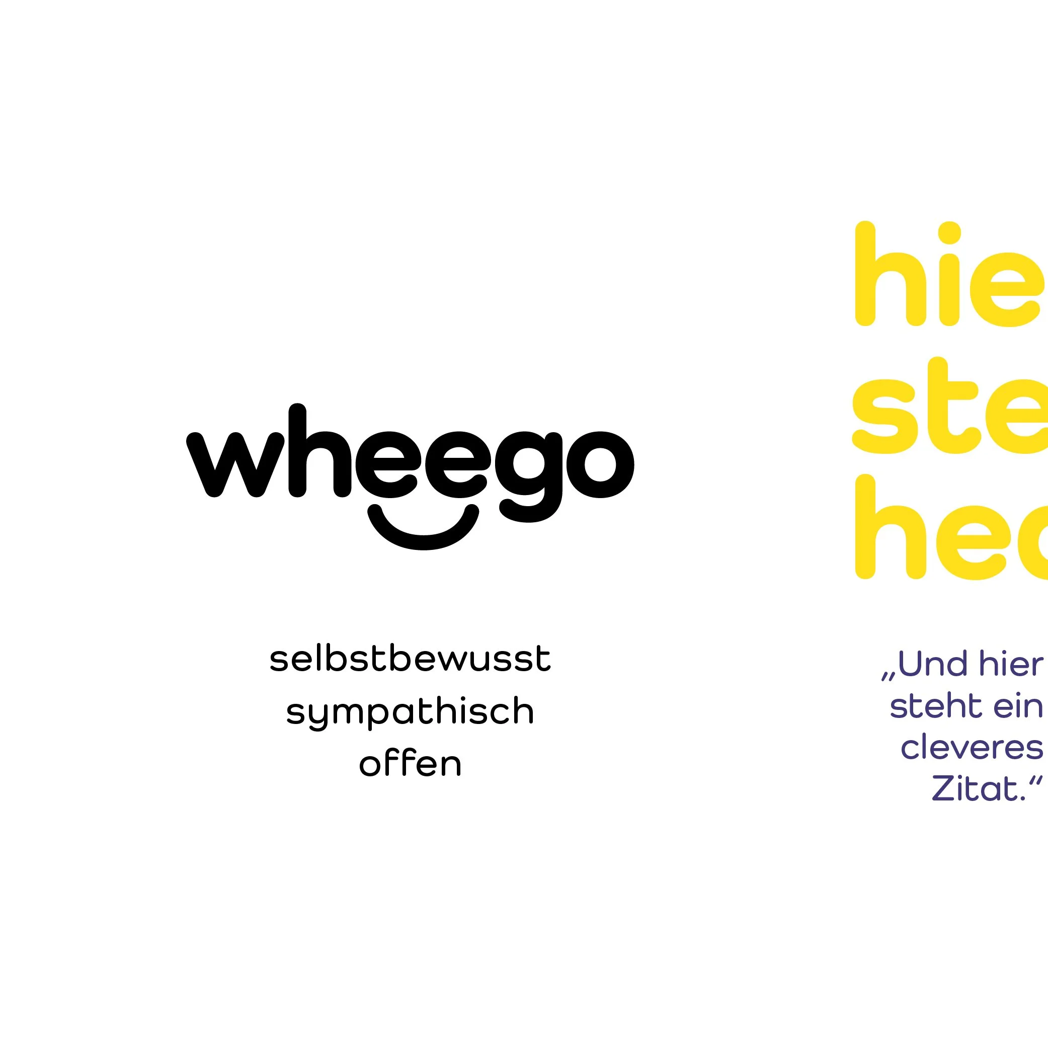
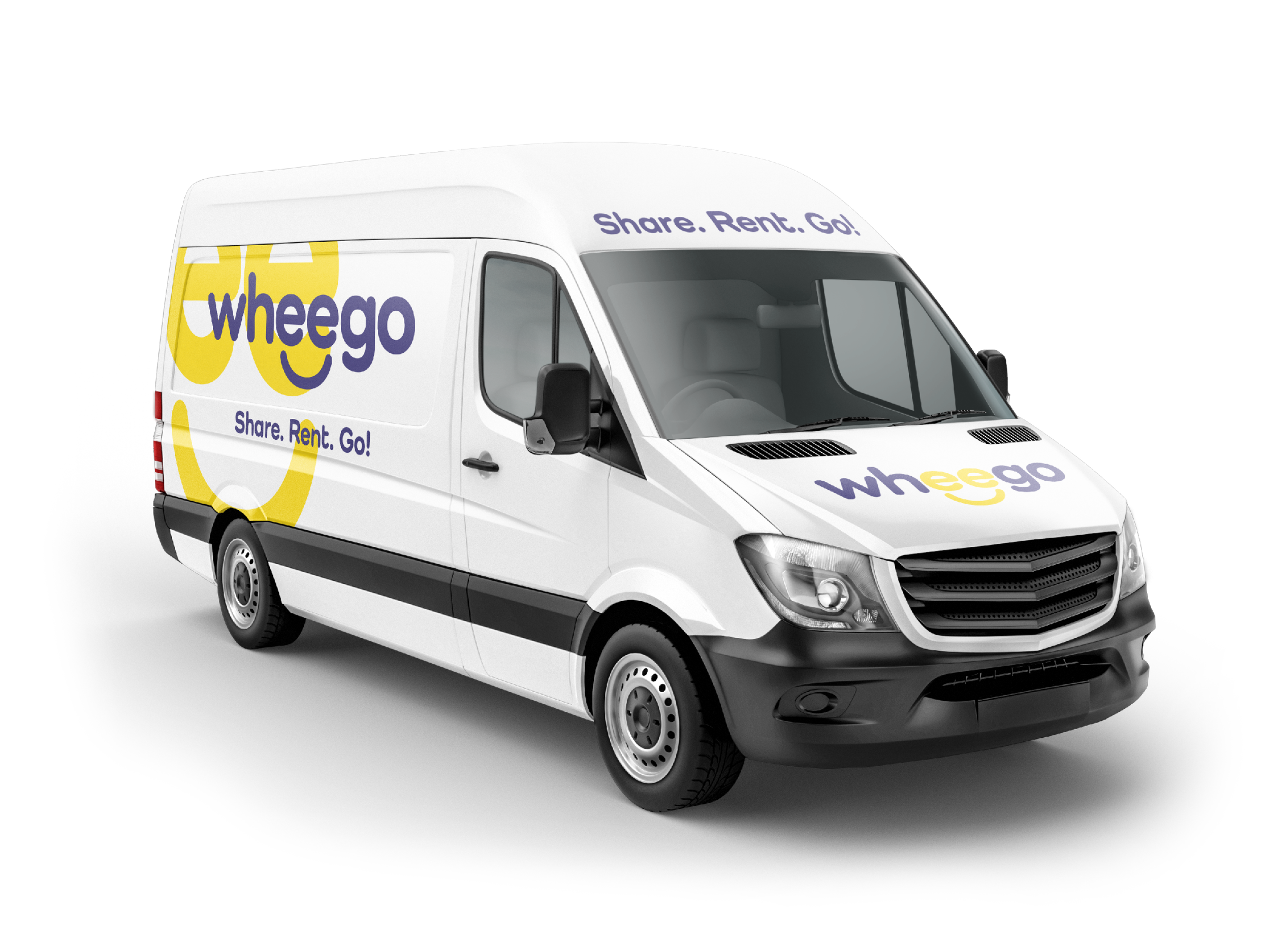
The Look: We moved away from neutral industry standards in favor of a lively, high-energy color palette that ensures visibility on city streets and digital interfaces.
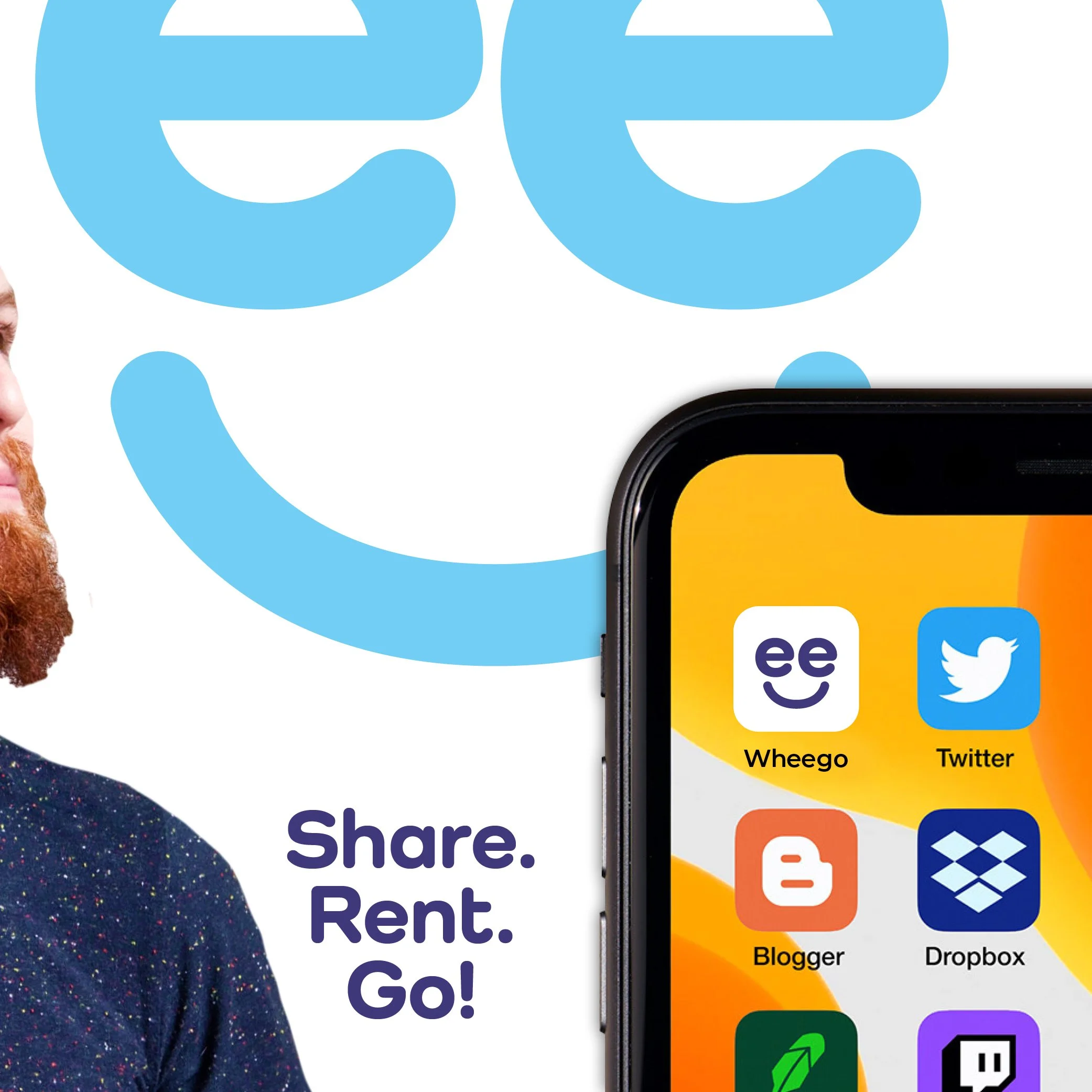
The Logo: A clean yet quirky typographic treatment that reflects the brand's flexible nature and youthful personality.
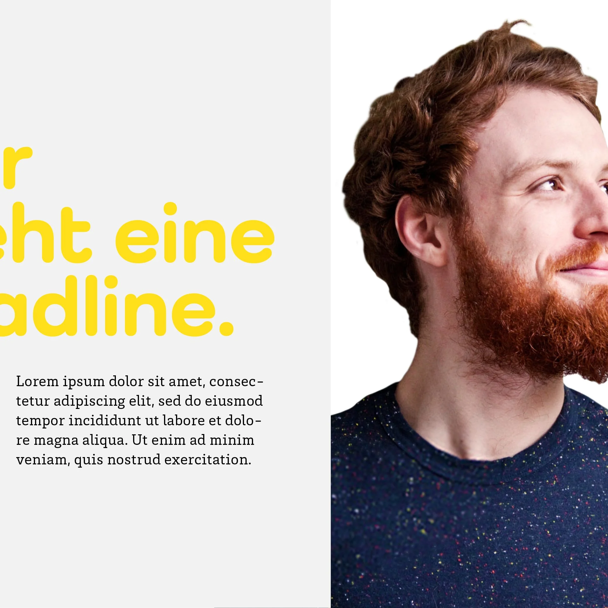
The Imagery: A dynamic photographic style that focuses on the "moment" and the feeling of exploration, rather than just the technical aspects of the vehicles.
The client embraced this energetic direction, recognizing it as the perfect vehicle for their market ambitions. I attribute the success of the project to an efficient, strategy-led workflow that transformed a start-up’s vision into a highly distinctive and market-ready brand identity.